

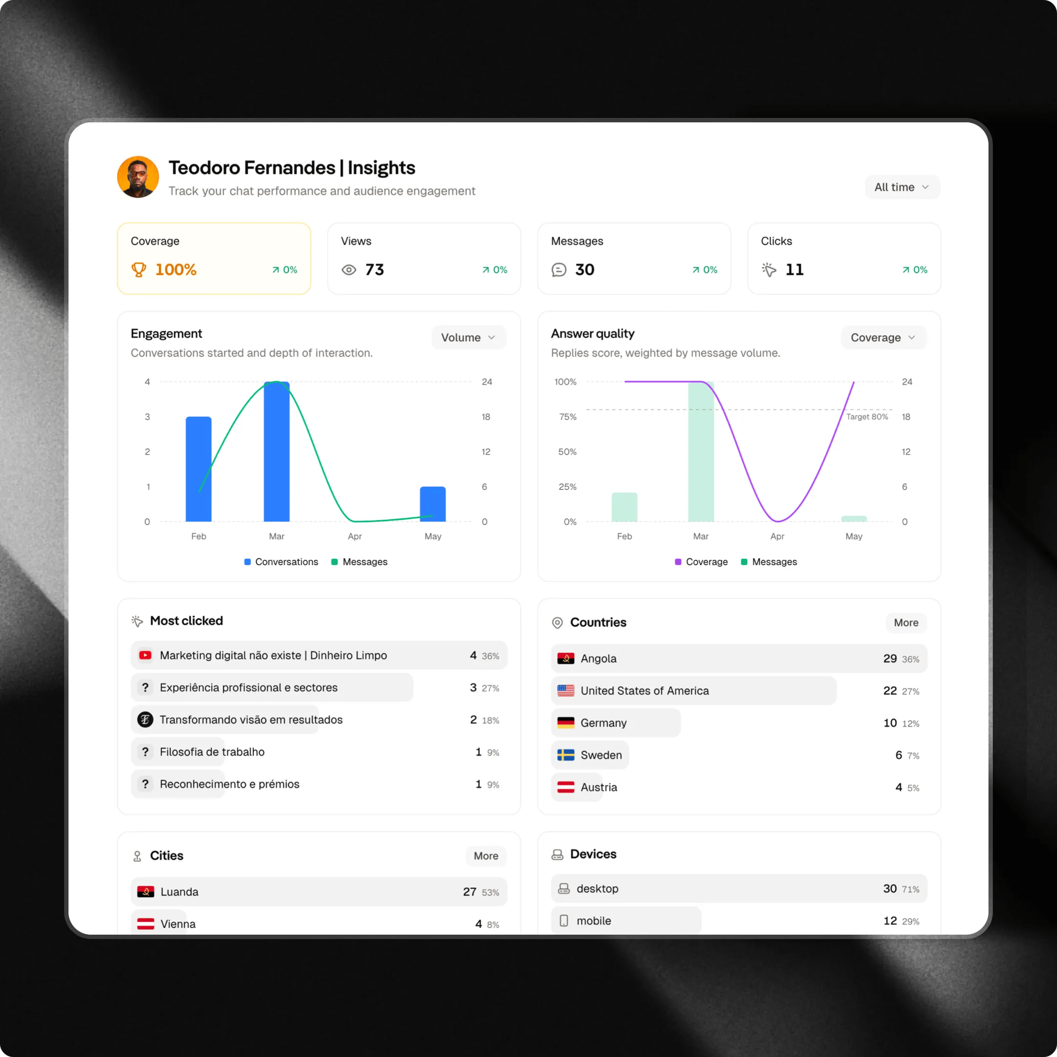
To access the Analytics dashboard, go to the overview tab in the left-hand sidebar menu.
Time Filters
In the top-right corner of the page, you’ll find the time range selector. It allows you to analyze data across different periods, making it easier to compare results and identify trends. Examples:- Today
- Last 7 days
- Last 30 days
- Last 90 days
- All time
Key metrics
The key metrics provide a quick overview of your chat’s health and performance.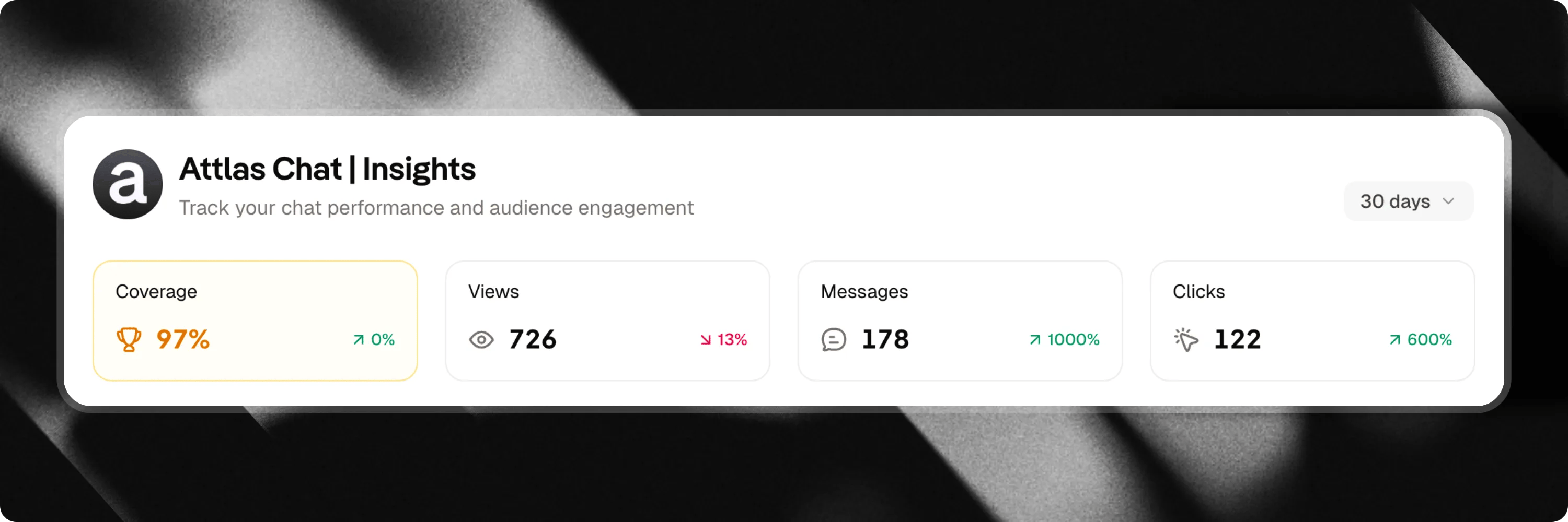
Coverage rate
The coverage rate measures your chat’s ability to answer user questions using the information available in its knowledge base.Covarage rate guide
Learn more about coverage rate in our complete guide
- 🟢 Above 80%: Your chat is well-trained and effectively serves your users’ needs.
- 🟡 Between 50% and 79%: There are knowledge gaps. Consider adding new sources or expanding existing content.
- 🔴 Below 50%: The user experience is being impacted. A review of your training content is strongly recommended.
- Add new knowledge sources.
- Update outdated documents.
- Review unanswered questions.
- Create content around frequently requested topics.
Views
Represents the total number of times your chat was viewed during the selected period. What does this metric show? The number of people who reached your chat. How to interpret:- High views with few messages may indicate low engagement.
- High views with many messages usually indicate strong interest and relevance.
Messages
Represents the total number of messages sent to your chat during the selected period. What does this metric show? The level of interaction generated by your chat. How to interpret:- A growing volume of messages indicates increasing usage.
- A decline may suggest lower interest or reduced traffic.
Clicks
Represents the total number of clicks on triggers, links, buttons and content shared by your chat. What does this metric show? The level of engagement generated by the recommendations and content presented. How to interpret:- A high number of clicks indicates strong interest in the shared content.
- Low click rates may suggest the need to improve triggers or calls to action.
Performance charts
Charts help you visualize trends and user behavior over time.Engagement
The engagement chart shows how users interact with your chat over time. You can switch between two different views to analyze your audience’s behavior.Volume
The volume view shows the relationship between the number of conversations started and the total number of messages exchanged. Metrics displayed:- Conversations
- Messages
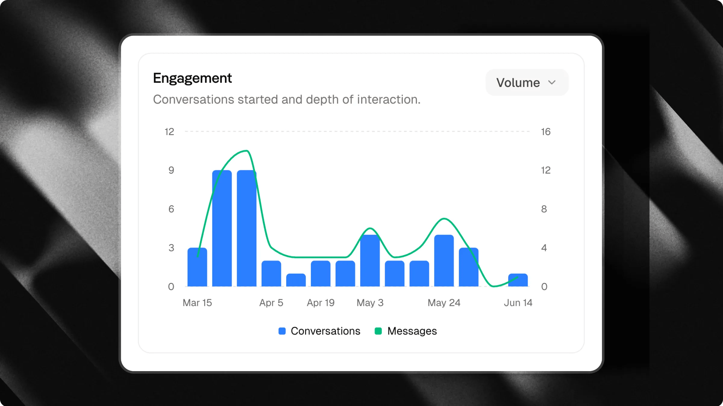
- 20 conversations
- 100 messages
- Many conversations with few messages may indicate quick interactions or low engagement.
- Many conversations with many messages usually indicate interested users and deeper discussions.
- An increase in message volume is often a sign of stronger user engagement.
Funnel
The funnel view helps you understand the user journey from viewing your chat to starting a conversation. Metrics displayed:- Views
- Clicks
- Conversations
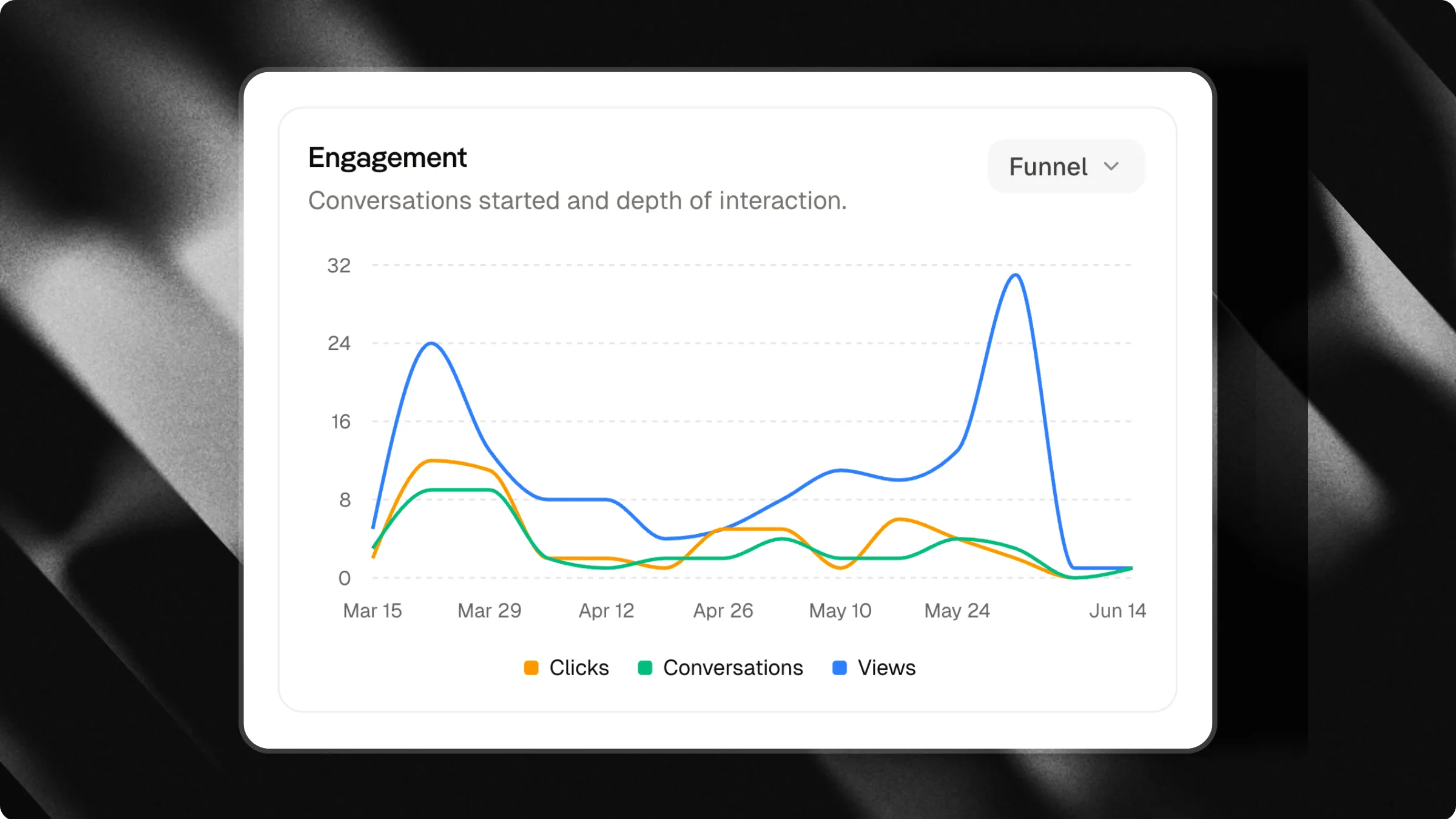
- 100 views
- 20 clicks
- 8 conversations
- Many views and few clicks may indicate that your triggers are not attractive enough.
- Many clicks and few conversations may indicate that most triggers are directing users to external content.
- Consistent growth in conversations is usually a sign that your chat is relevant and engaging.
Answer quality
The answer quality chart helps you monitor the quality of interactions and your chat’s ability to meet user needs. You can switch between two different views.Coverage
The coverage view shows the average coverage rate of user messages during the selected period. This metric indicates how effectively your chat was able to answer questions using information from its knowledge base.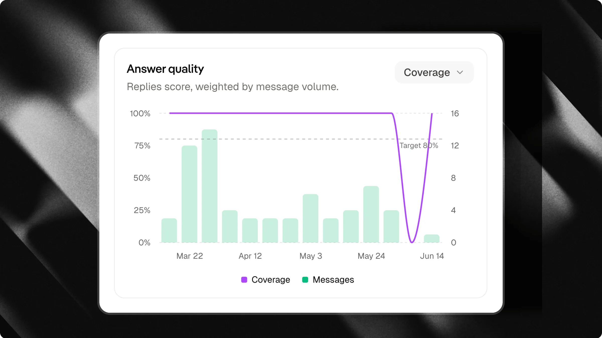
- 3 conversations were started
- 20 messages were exchanged
Conversation depth
The conversation depth view shows the average number of messages exchanged per conversation during the selected period. This metric helps you understand the depth of user interactions.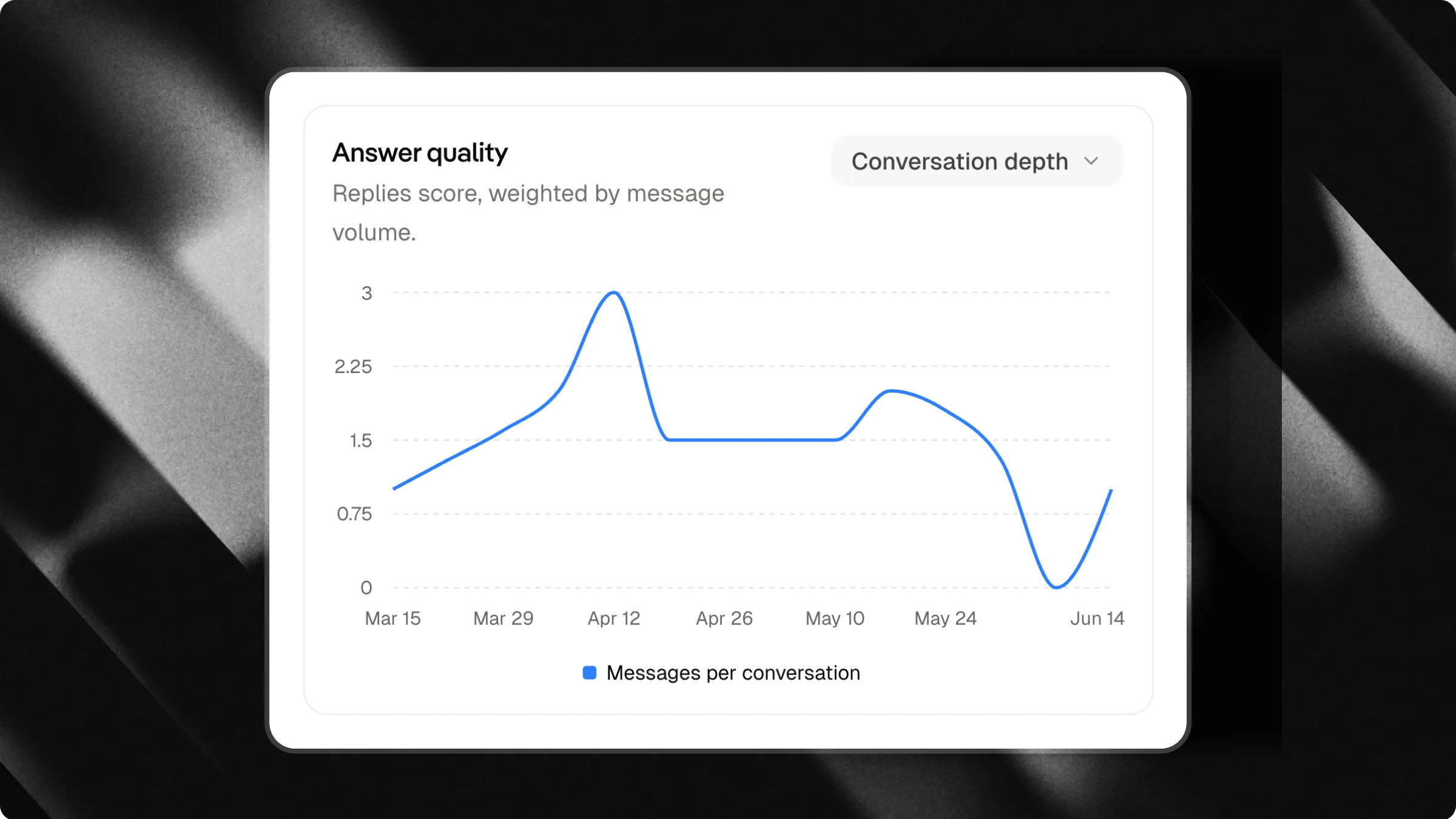
- Deeper conversations often indicate stronger engagement and user interest.
- Very short conversations may indicate that users quickly found the information they needed or lost interest.
- A gradual increase in conversation depth is generally a positive sign of relevance and usefulness.
What is a good conversation depth?
There is no universal benchmark. A support chat may require only a few messages to solve a problem, while an educational or advisory chat may naturally generate longer conversations. The most important thing is to track how this metric evolves over time and compare it with your coverage rate.Audience insights
Learn where your users come from, what they click on and how they access your chat.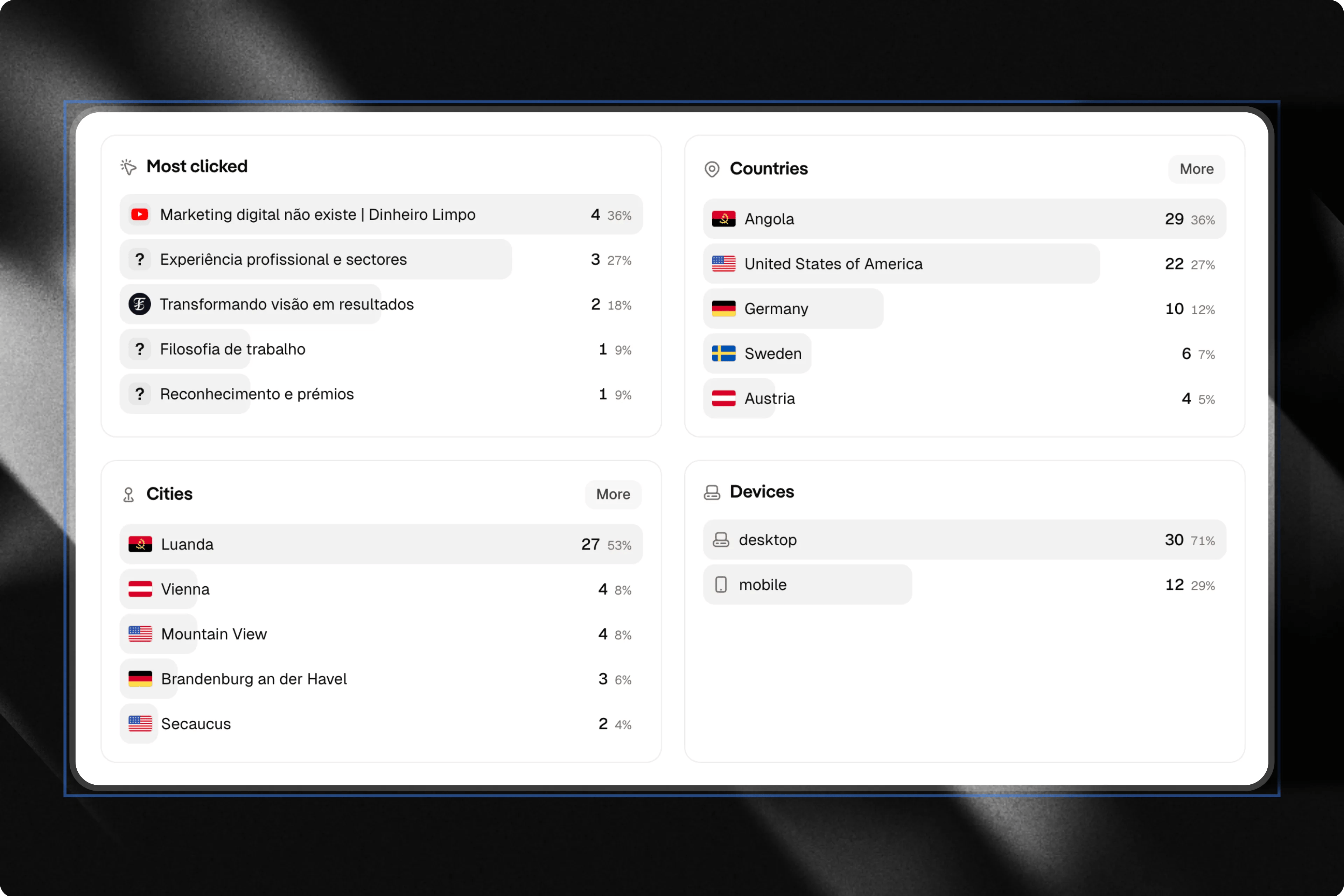
Most clicked content
The most clicked section shows which triggers, links and content received the most interactions. How to use this information:- Identify the most popular topics.
- Understand what captures your audience’s attention.
- Create new content related to the most accessed subjects.
Countries
The countries section displays the geographic distribution of your users. How to use this information:- Identify relevant markets.
- Discover new audiences.
- Adapt content for specific regions.
Cities
The cities section shows the cities where your users are located. How to use this information:- Plan local campaigns.
- Identify regional opportunities.
- Better understand your audience.
Devices
The devices section shows which types of devices users are using to access your chat. The main device categories are:- Mobile
- Desktop