> ## Documentation Index
> Fetch the complete documentation index at: https://attlas.so/docs/llms.txt
> Use this file to discover all available pages before exploring further.
# Customization
> Create a visual experience that reflects your identity
The **Themes** tab is Attlas visual customization space.
A well-designed chat doesn't just look better, it creates a more professional, memorable and engaging experience for your users.
In the **Customize** section, you'll find all the tools you need to personalize the visual appearance of your Attlas chat.
Here, you can adjust colors, typography, layout, background images and other visual elements to create an experience aligned with your brand, project, or personal identity.
These customization options were designed to help you transform your chat into something truly unique while maintaining a consistent experience for everyone who interacts with it.
Go to `Settings → Themes` to personalize your chat's appearance.
Visit the Themes section in Get Started
***
## What you'll find in this section
The Attlas customization area is divided into different groups of settings.
You can customize:
* Colors
* Layout
* Typography
* Background Images
Let's explore each of these options in more detail.
**Live Preview:** Throughout the customization process, you'll be able to see all changes instantly in a real-time chat preview. This makes customization easier and ensures everything looks exactly the way you want before saving.
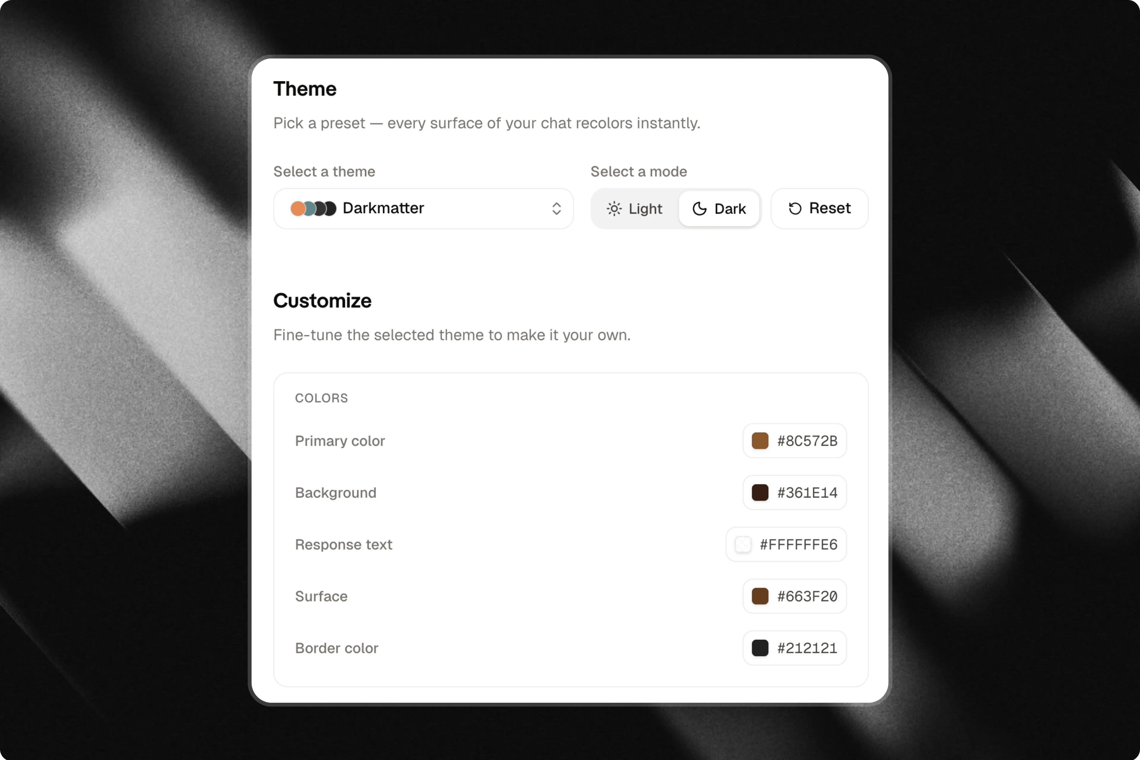
## Colors
Define your chat's primary colors, including buttons, backgrounds, text and highlighted elements.
Colors help reinforce your visual identity and create a more consistent experience for your users.
 ## Layout
Adjust the shape and appearance of your chat components.
You can configure elements such as corner radius, shadows and visual styles to make your chat feel more modern, minimalistic, or friendly.
## Typography
Choose the fonts used throughout your chat.
Typography directly influences readability and personality, helping you create a more professional, creative, or institutional experience.
## Background images
Add custom background images to make your chat more unique.
You can upload your own images or use external images to create an experience that matches your content and visual identity.
Attlas automatically adjusts text colors based on the selected background. Dark backgrounds use light text, while light backgrounds use dark text, ensuring optimal readability.
## Make it truly yours
Once you've finished configuring the Themes tab, your chat will reflect your visual identity much more accurately.
The content remains the same, but the visual experience becomes more professional, memorable and aligned with your brand.
## Testing your chat
After saving your changes, all customizations will be applied automatically and your chat will be ready to share.
Before doing so, we recommend testing your chat using the **Playground**.
The Playground is a dedicated environment where you can experiment with your chat's knowledge, personality and responses without consuming messages from your plan.
## Why customize your chat?
These settings allow Attlas to communicate exactly the way you want.
You can create a chat that is:
* More **professional** for businesses and organizations;
* More **casual** for creators and communities;
* More **welcoming** for education, support, or guidance;
* More **creative** for entertainment and interactive experiences.
All of this can be configured in a simple, intuitive and flexible way, ensuring that your chat's personality reflects your brand and delivers a more consistent experience to users.
## Layout
Adjust the shape and appearance of your chat components.
You can configure elements such as corner radius, shadows and visual styles to make your chat feel more modern, minimalistic, or friendly.
## Typography
Choose the fonts used throughout your chat.
Typography directly influences readability and personality, helping you create a more professional, creative, or institutional experience.
## Background images
Add custom background images to make your chat more unique.
You can upload your own images or use external images to create an experience that matches your content and visual identity.
Attlas automatically adjusts text colors based on the selected background. Dark backgrounds use light text, while light backgrounds use dark text, ensuring optimal readability.
## Make it truly yours
Once you've finished configuring the Themes tab, your chat will reflect your visual identity much more accurately.
The content remains the same, but the visual experience becomes more professional, memorable and aligned with your brand.
## Testing your chat
After saving your changes, all customizations will be applied automatically and your chat will be ready to share.
Before doing so, we recommend testing your chat using the **Playground**.
The Playground is a dedicated environment where you can experiment with your chat's knowledge, personality and responses without consuming messages from your plan.
## Why customize your chat?
These settings allow Attlas to communicate exactly the way you want.
You can create a chat that is:
* More **professional** for businesses and organizations;
* More **casual** for creators and communities;
* More **welcoming** for education, support, or guidance;
* More **creative** for entertainment and interactive experiences.
All of this can be configured in a simple, intuitive and flexible way, ensuring that your chat's personality reflects your brand and delivers a more consistent experience to users.